2te-Zahnartzmeinung.de is een Duits tandheelkundig platform waar patiënten hun tandbehandelingen kunnen uploaden om concurrerende aanbiedingen van tandartsen te ontvangen. Hoe kan de service worden verbeterd met een concrete strategie voor het beheren van de klantreis?
Projectoverzicht: 2 weken tijdens de bootcamp + 4 weken daarna | Team van 3 UX-ontwerpers
Uitdaging
In de loop van de tijd was het 2te-Zahnartzmeinung-platform gegroeid, maar de overkoepelende visie was verloren gegaan, wat een negatieve invloed had op de gebruikerservaring. Doel: De service verbeteren door systematisch in te spelen op de behoeften en ervaringen van tandheelkundige patiënten via een op maat gemaakte en concrete strategie voor het beheren van de klantreis.
In de loop van de tijd was het 2te-Zahnartzmeinung-platform gegroeid, maar de overkoepelende visie was verloren gegaan, wat een negatieve invloed had op de gebruikerservaring. Doel: De service verbeteren door systematisch in te spelen op de behoeften en ervaringen van tandheelkundige patiënten via een op maat gemaakte en concrete strategie voor het beheren van de klantreis.
Research en User Interviews
Ons UX-team voerde onderzoek uit, onderzocht het proces en interviewde zes mensen over hun eerste indrukken van de huidige website.
Conclusie uit de gebruikersinterviews: Patiënten in Duitsland beschouwen hun tandarts als een autoriteitsfiguur en zijn niet gewend om kritisch te zijn over tandartstarieven. Het idee om behandelplannen te uploaden voor lagere biedingen of te onderhandelen met tandartsen is voor hen een nieuw concept.
Conclusie uit de gebruikersinterviews: Patiënten in Duitsland beschouwen hun tandarts als een autoriteitsfiguur en zijn niet gewend om kritisch te zijn over tandartstarieven. Het idee om behandelplannen te uploaden voor lagere biedingen of te onderhandelen met tandartsen is voor hen een nieuw concept.

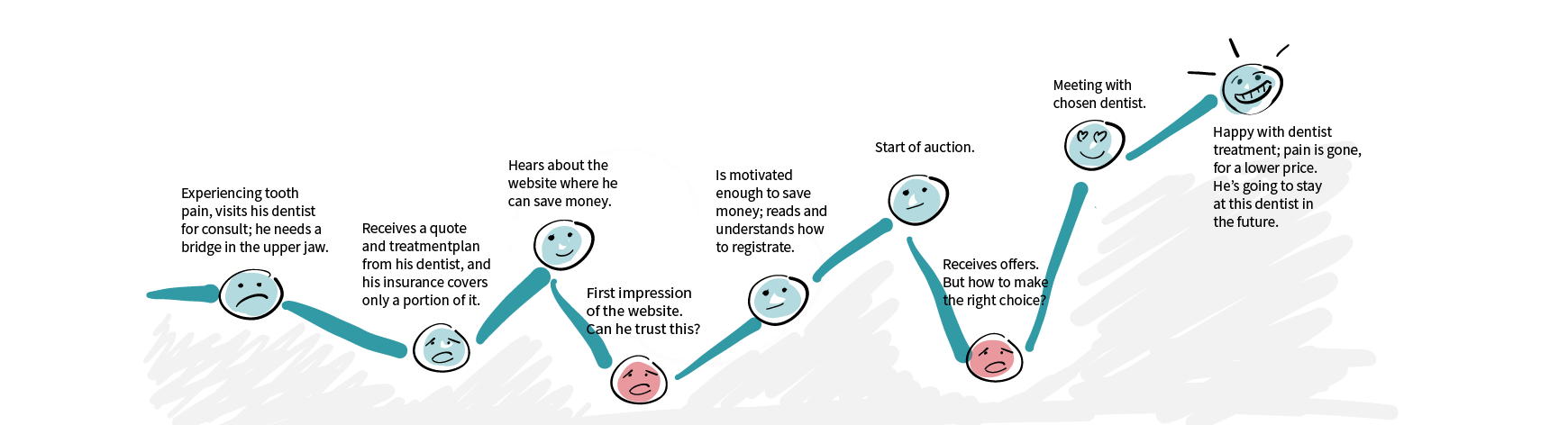
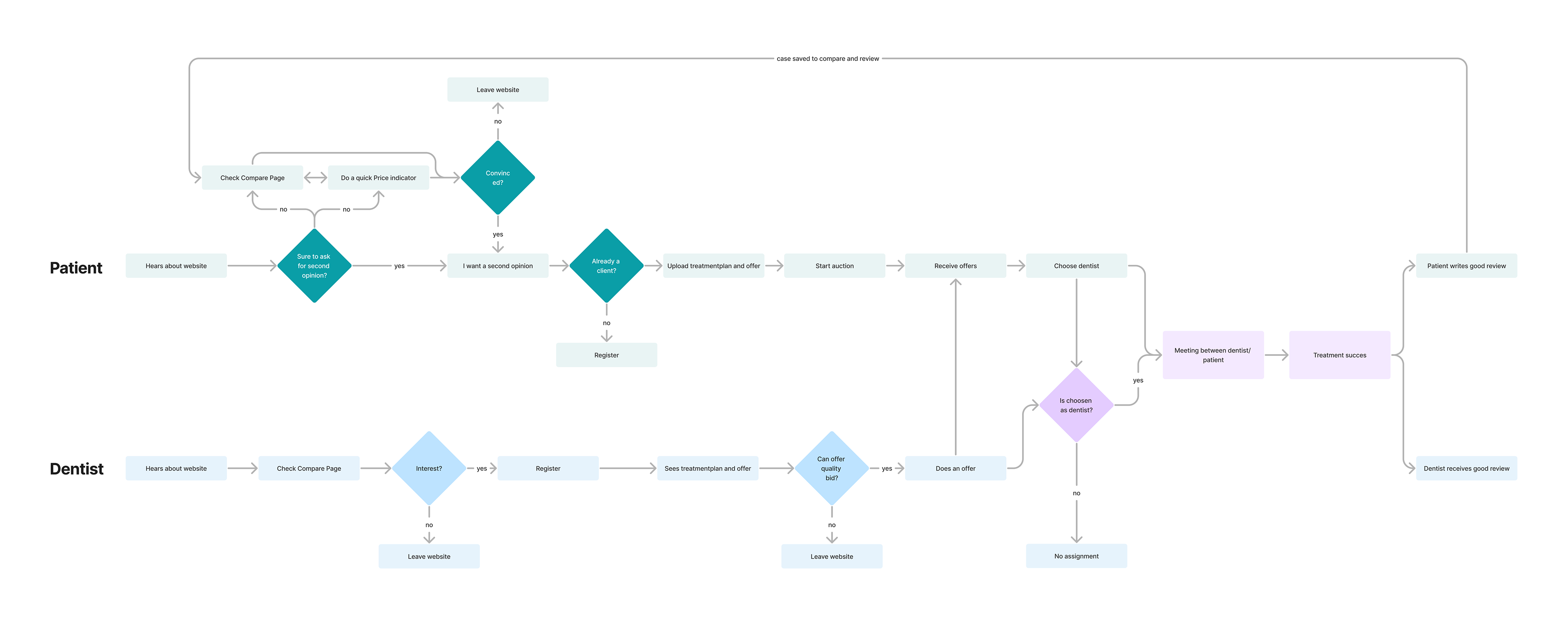
Patient journey
We hebben verschillende pijnpunten ontdekt tijdens de klantreis. Het idee van geld besparen spreekt iedereen aan, maar de website wekt onvoldoende vertrouwen. Bovendien is het concept niet direct duidelijk voor hen—hoe kunnen ze deelnemen? Zodra hun behandeling online staat en ze biedingen kunnen ontvangen, ontstaat het volgende pijnpunt. Hoe maken ze een goede keuze tussen de biedingen? De tandartsen zijn anoniem. Pas nadat ze een keuze hebben gemaakt, wordt de gekozen tandarts onthuld.
Dentist journey
Dit platform kan alleen slagen als het voordelen biedt voor tandartsen en een netwerk van tandartsen door heel Duitsland opbouwt. Tandartsen reageren op interessante behandelaanvragen wanneer het hen uitkomt of wanneer deze aansluiten bij hun specialisaties. Een eerdere kwalitatieve behandeling tegen een concurrerende prijs is te vinden op de vergelijkingspagina, wat patiënten inzicht geeft in de kosten. Als de tandarts een positieve beoordeling ontvangt, wekt dit vertrouwen voor toekomstige biedingen.
Homepage sketching
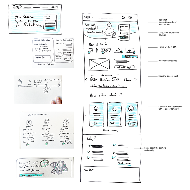
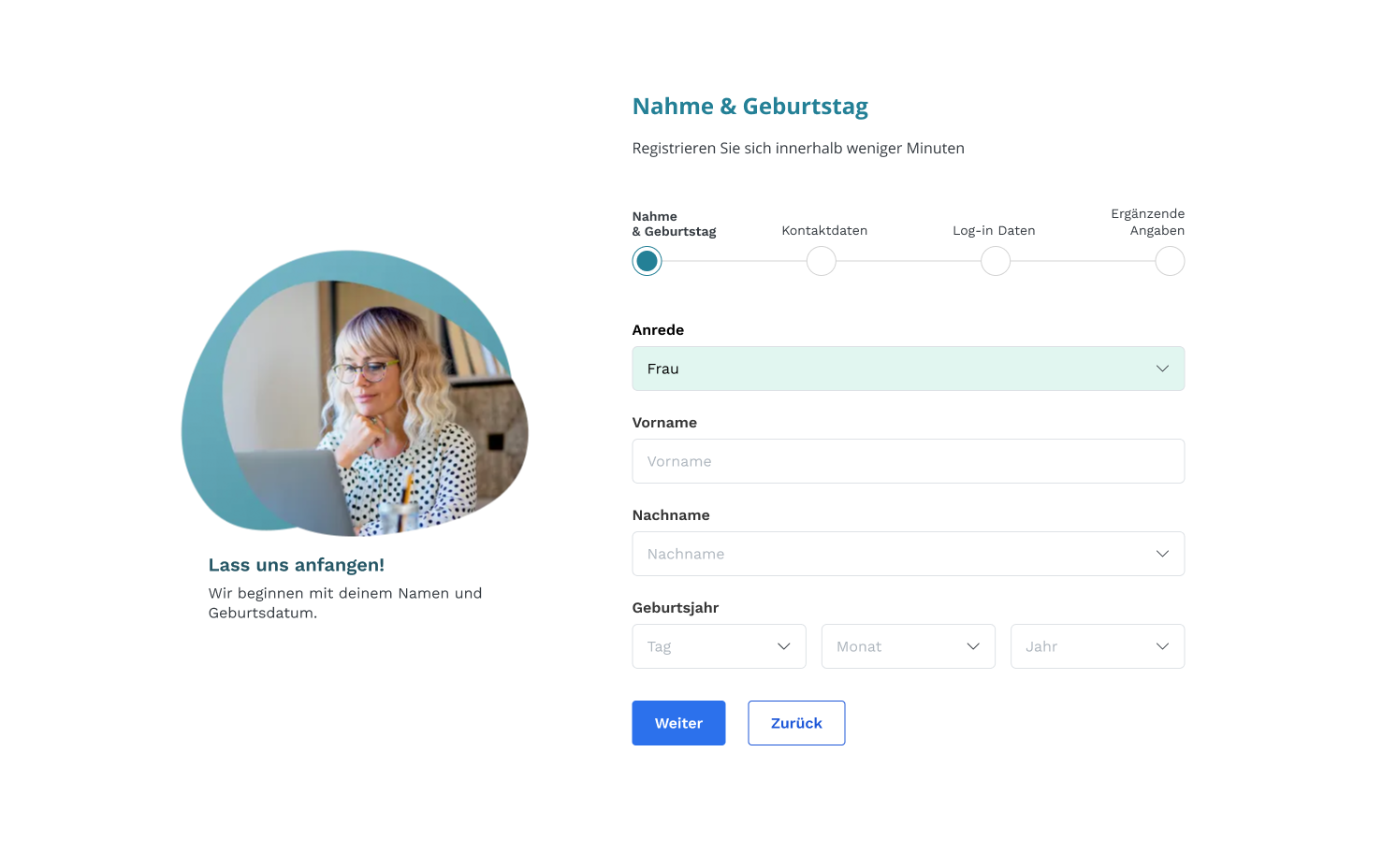
Vereenvoudig de onboarding
Vereenvoudig het registratieproces voor patiënten om het gebruiksvriendelijk te maken. We hebben het aantal stappen om een account aan te maken verminderd en duidelijke, begeleidende instructies tijdens het proces toegevoegd. Een voortgangsbalk informeert de gebruikers over hun registratievoortgang, en visuele aanwijzingen en tooltips begeleiden gebruikers door het platform.

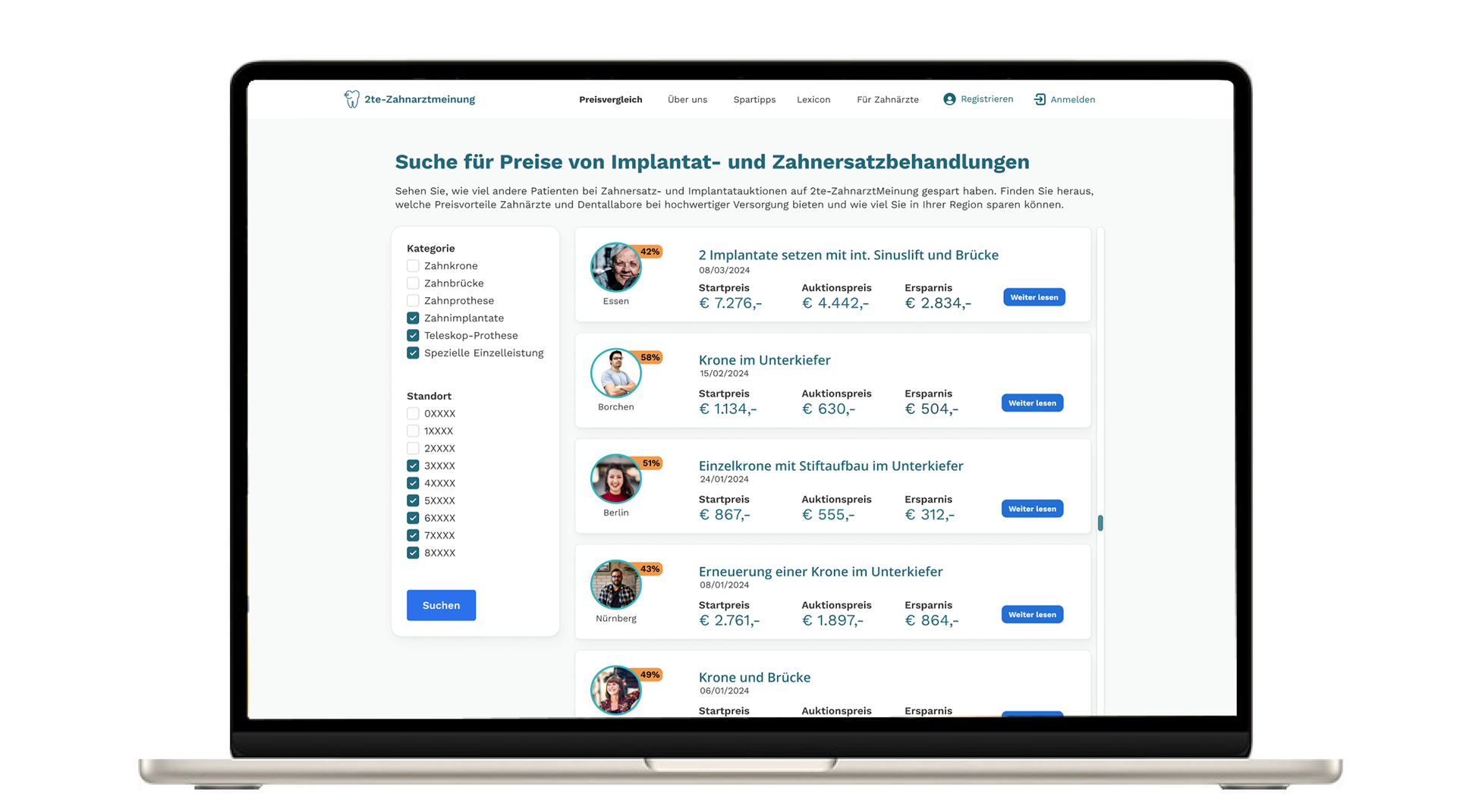
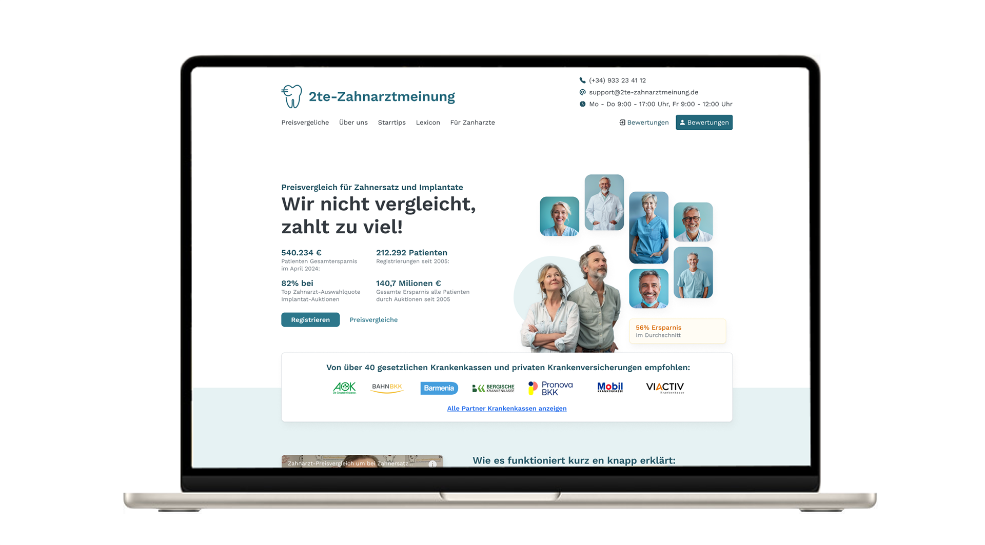
Inzichten verkrijgen
Alle voltooide behandelingen zijn zichtbaar voor bezoekers op de prijsvergelijkingspagina. Ze kunnen zoeken op behandeling of locatie en een overzicht krijgen van de ontvangen biedingen. Maar er is meer – je kunt doorklikken om meer informatie over de behandeling te zien en de ervaring van de patiënt te lezen. Dit is essentieel, omdat het inzicht biedt in hoe anderen hebben deelgenomen, hun tevredenheid over het proces en hoeveel geld ze hebben bespaard. Door echte mensen en hun besparingen te tonen, wordt vertrouwen opgebouwd.